Bryn Athyn Brand Guide
Bryn Athyn Brand Guide
We have created these Brand Guidelines to assist in the rollout of our current brand and to serve as high-level inspiration as we develop future brand communications.
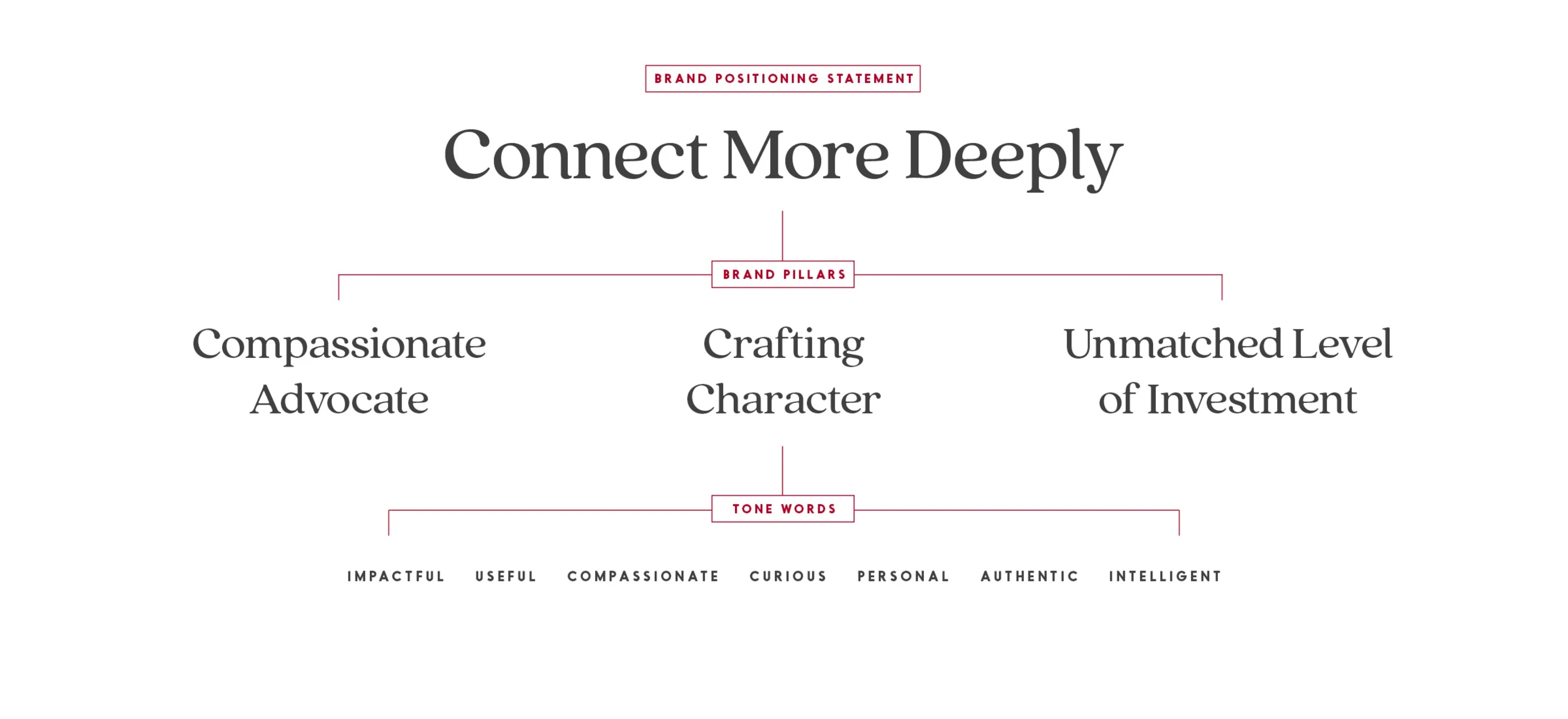
Positioning Statement
What’s The Idea?
In a world where interactions are increasingly superficial, Bryn Athyn is a place where your studies, your spirituality, interpersonal relationships--and even the definition of true career success--go beneath the surface.
Copy & Tone of Voice
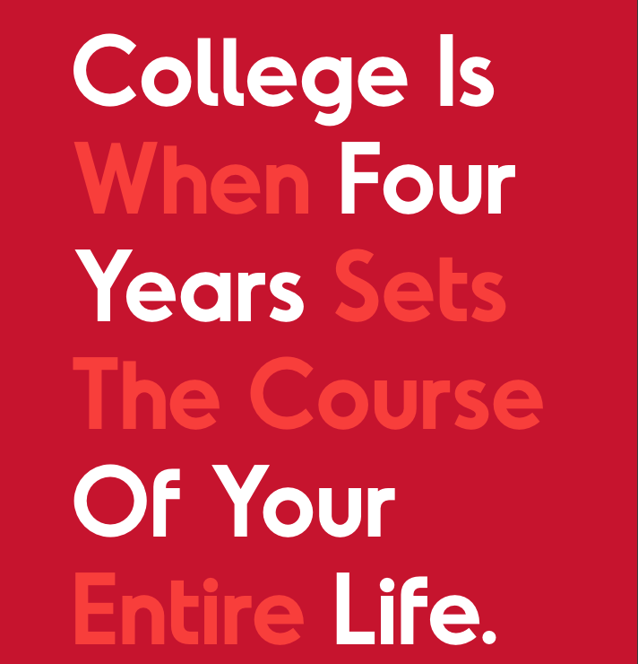
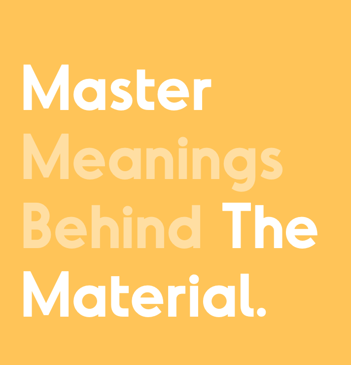
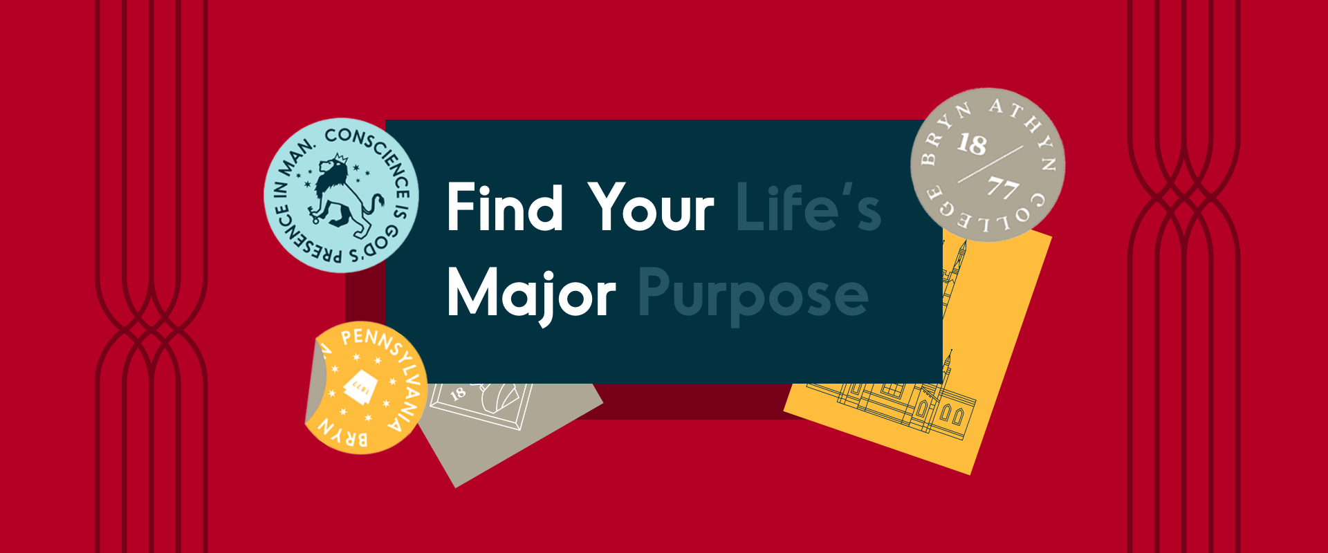
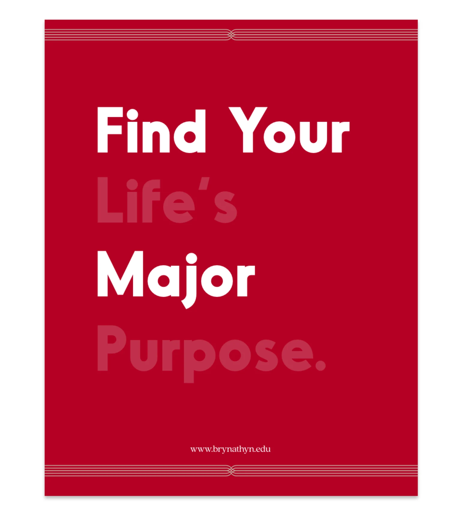
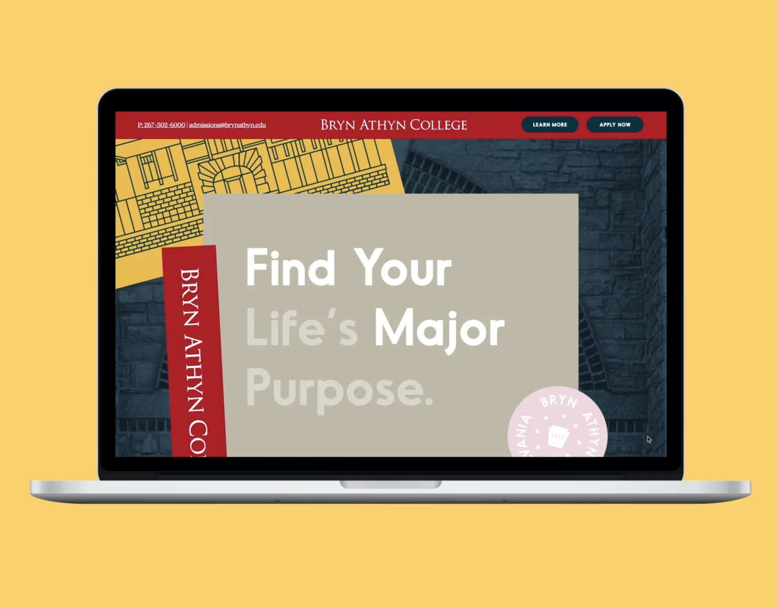
The Bryn Athyn voice should reflect the school and be warm, friendly, and relatable. Key elements of the brand are the unique Dual-Read Headlines. These headlines convey the concept of how Bryn Athyn goes beneath the surface of what one would normally expect from a college. For instance, the headline “Find Your Life’s Major Purpose” is written and designed in a way to invite the reader to see the deeper meaning. A typical college may ask you to “Find Your Major,” while at Bryn Athyn, we go deeper and ask you to “Find Your Life’s Major Purpose.”
Dual-Read Headlines
Dual-Read Headlines should not be forced into every execution and should only be used when they strengthen the piece. If there is a question about one, it’s better to leave it out and write a more traditional headline instead.
Grammar and Content Style Consistancy
Questions regarding grammatical applications to Bryn Athyn materials should refer to the Bryn Athyn Style Guide (BAC Microsoft account access required, external vendors should reach out to the Marketing Team for access)
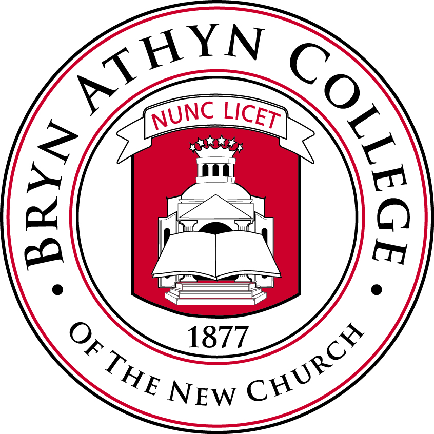
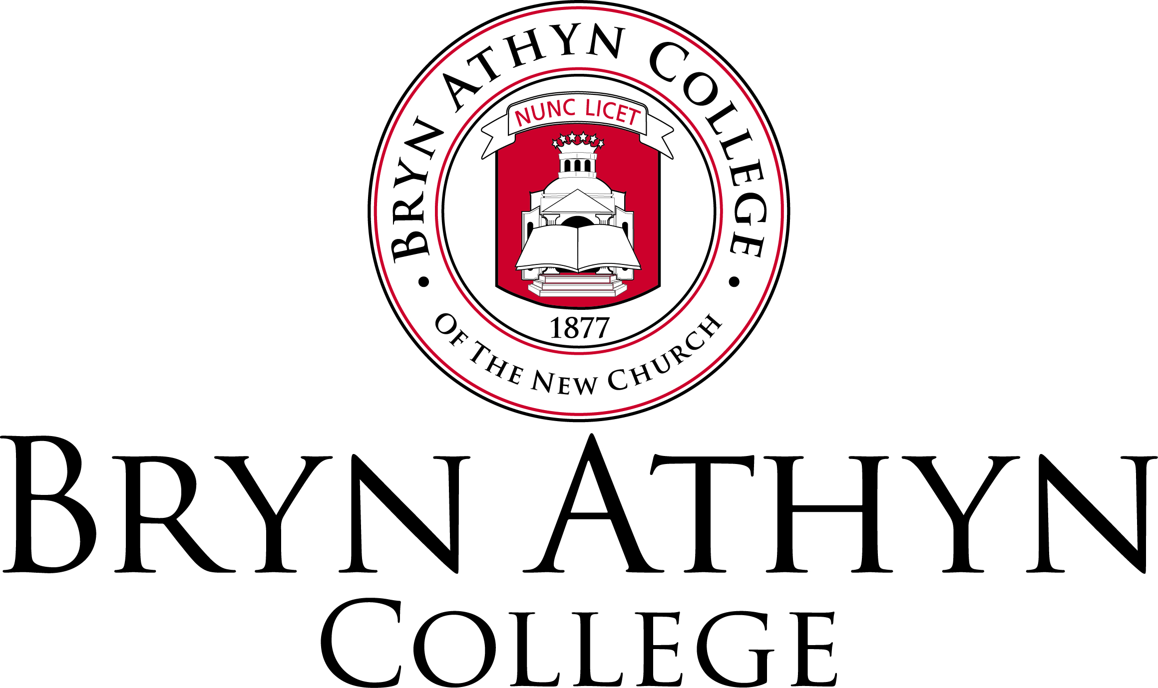
Logo
The Bryn Athyn College wordmark is a typographical treatment of our institutional name. It is designed for broad use throughout the College brand. There are a variety of approved versions of the wordmark, designed for use in color, black and white, formal, casual, print, and digital executions. The wordmark should never be stretched, warped, pixelated, changed to a new color, or otherwise manipulated. Never place any image or text so that it obscures, or partially obscures, the college wordmark. If you need a version of the wordmark not included in these brand guidelines, please contact the Marketing Department.
Primary Wordmark
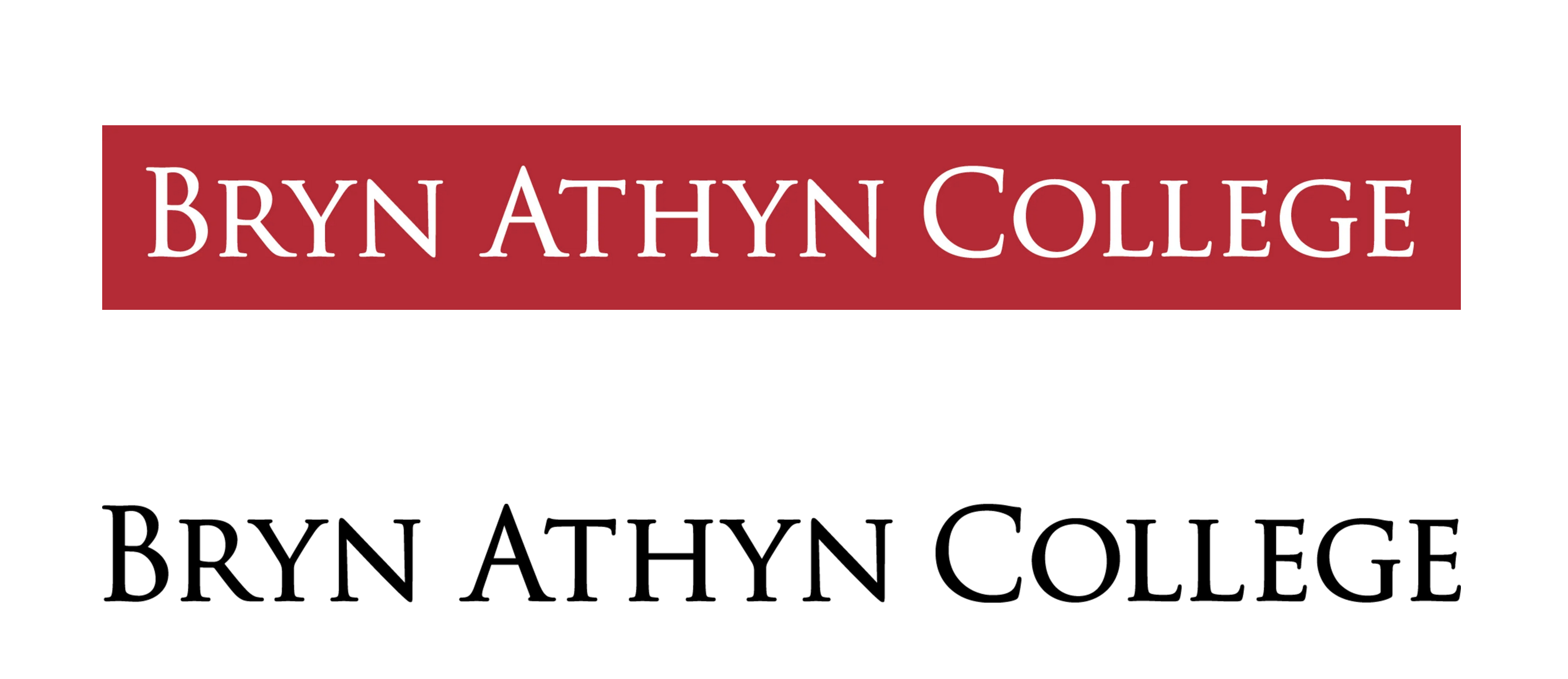
Secondary Wordmark
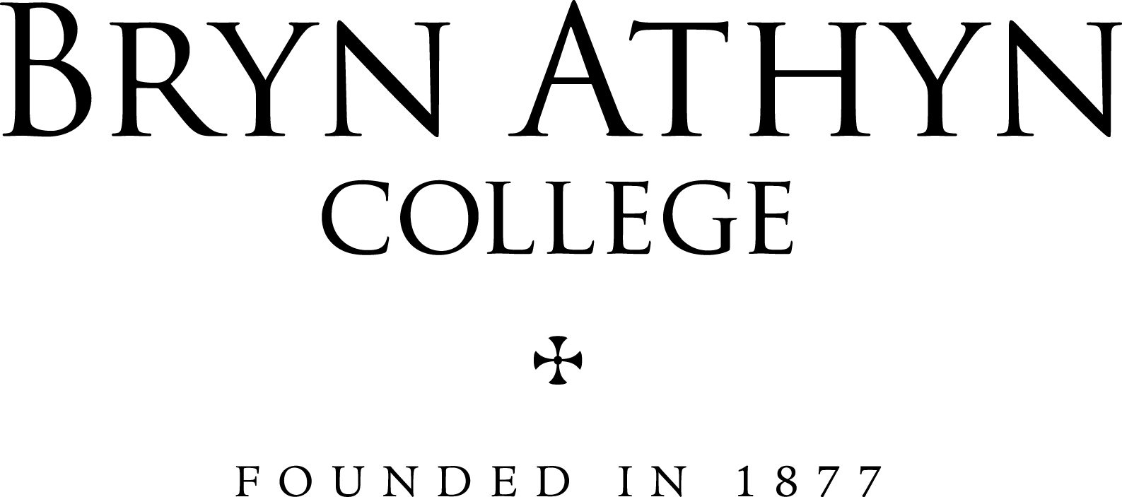
Seal
Official Seal Stacked
Color Palette
The Bryn Athyn color palette breaks down into two parts. The primary color palette should be used across all brand communications. Bryn Athyn Red should be the dominant color while Navy, Stone, and Warm Red can be used as accents. The secondary color palette should be used sparingly as accent colors for graphic elements or to bring a pop of color to brand communications. Ideally, these colors would be used in longer-form pieces to bring a sense of variety to an overall piece. Black and white are accent colors that can be used sparingly across all color palettes.
Primary Color Palette
Bryn Athyn Red
|
|
- HEX #b50025
- RGB 181, 0, 37
- CMYK 0, 100, 79, 20
- PMS 187
Bryn Athyn Navy
|
|
- HEX #00323f
- RGB 0, 50, 63
- CMYK 100, 60, 51, 40
- PMS 548
Bryn Athyn Stone
|
|
Bryn Athyn Yellow
|
|
Secondary Color Palette
Bryn Athyn Warm Red
|
|
Bryn Athyn Rose
|
|
- HEX #f1d6de
- RGB 241, 214, 222
- CMYK 0, 12, 0, 0
- PMS 705 at 50%
Bryn Athyn Light Blue
|
|
White
|
|
Black
|
|
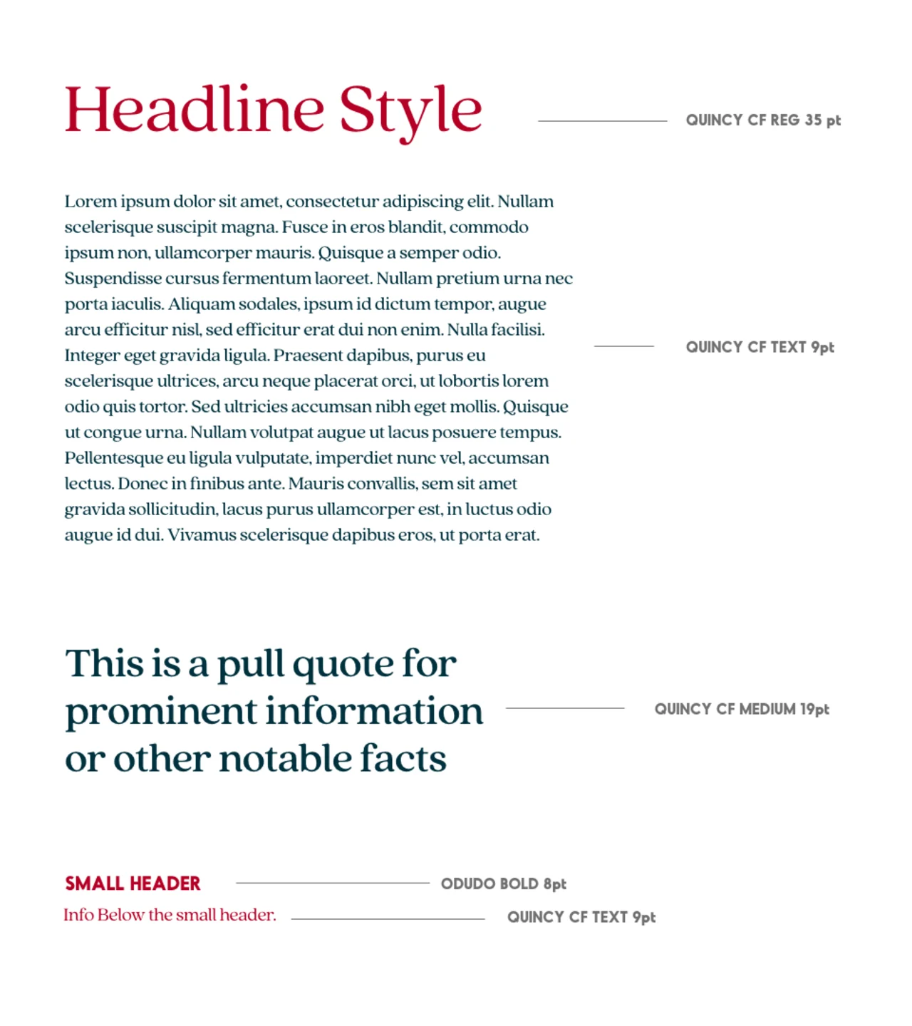
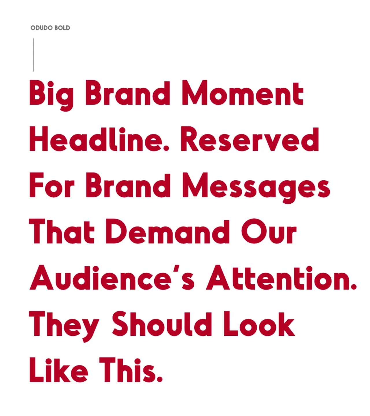
Typography
The two main typefaces for Bryn Athyn are Quincy CF and Odudo. They were chosen to feel modern and legible but have a slight flair to them.

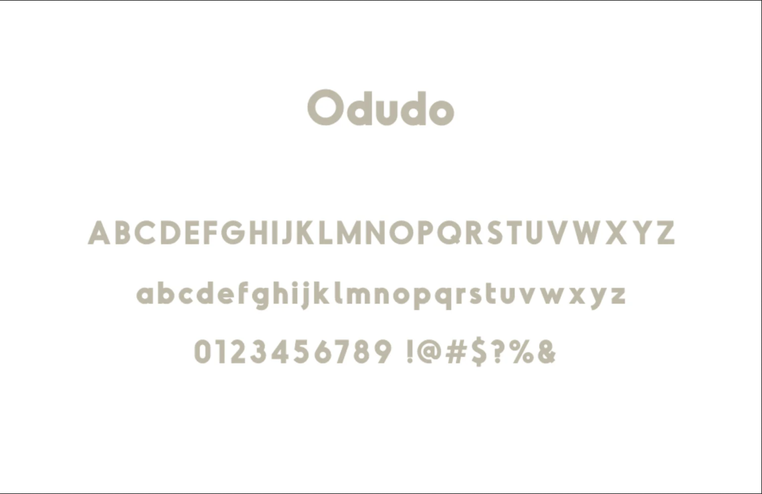
Type Styles
Type Hierarchy
Brand Moment
Graphic Elements
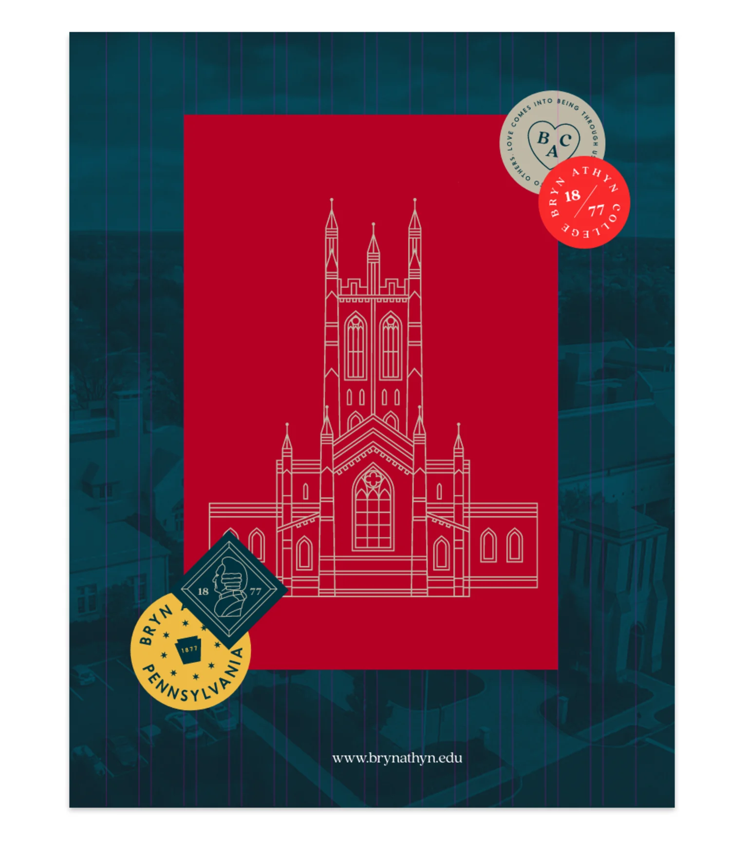
The Illustrative elements celebrate the rich history of Bryn Athyn and the beauty of this suburban borough. Use these elements to enhance layouts or in place of photographic elements.
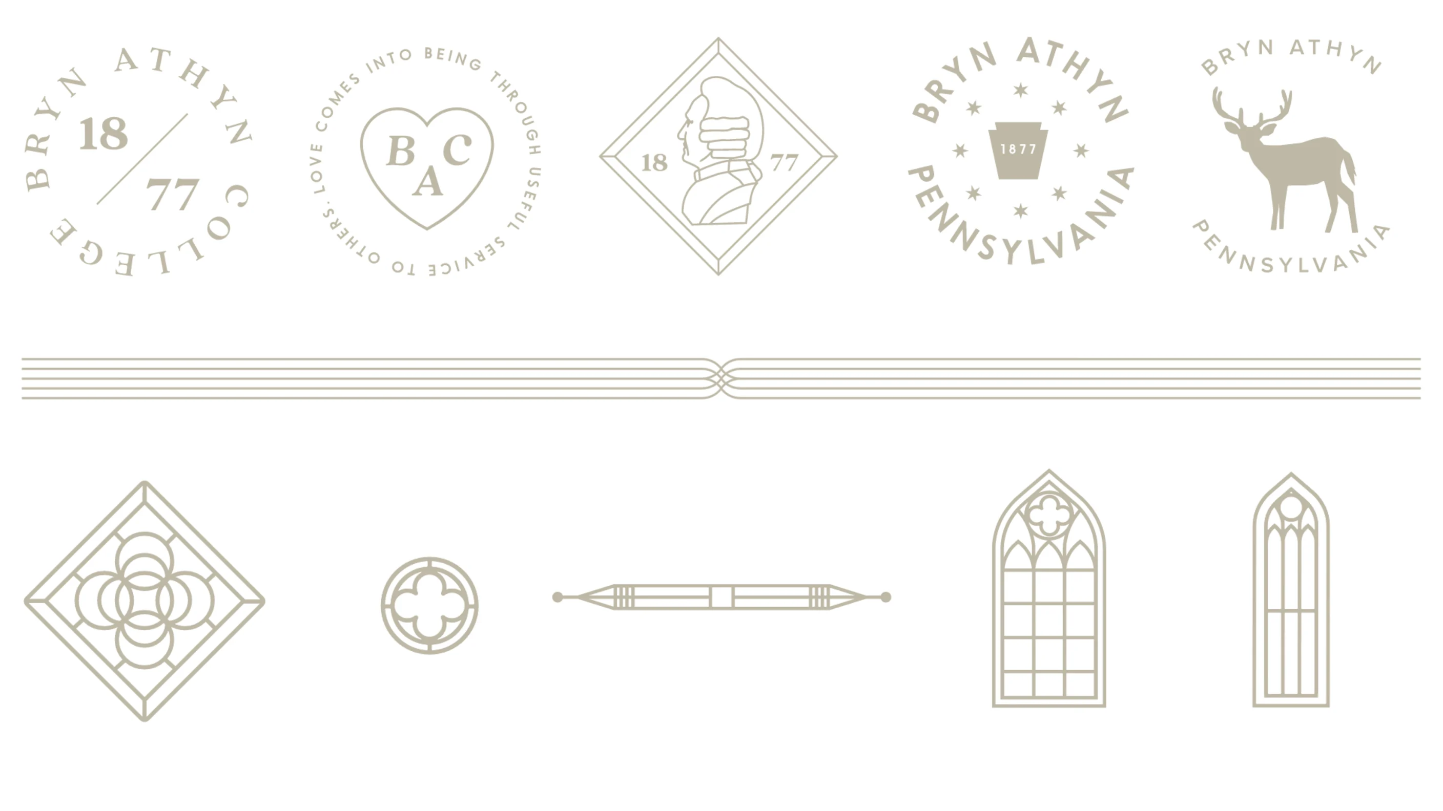
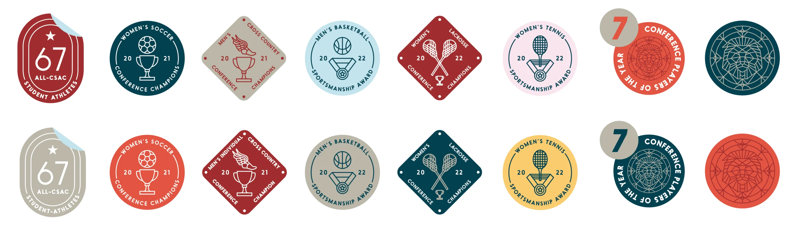
Bryn Athyn Stickers
The Bryn Athyn stickers are graphic elements that illustrate school SPIRITuality. Use these graphics to enhance brand communications with a sense of Bryn Athyn pride. These elements can be stacked to create a sense of layers and encourage audiences to dig deep and learn more about Bryn Athyn College. For more color combination options, please contact the Marketing Office.

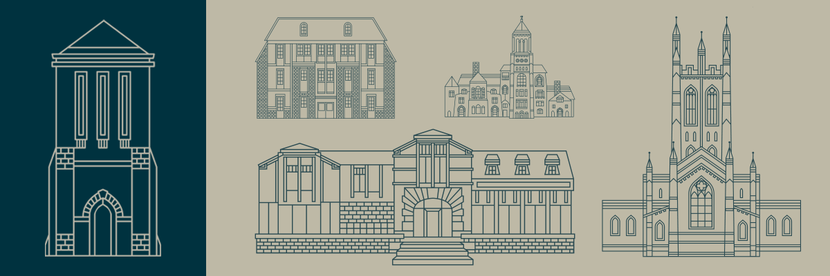
Architecture Line Drawings
These architectural illustrations give the Bryn Athyn brand a sense of history and place in modern and graphic execution. The iconic cathedral illustration represents the College and the teachings of the New Church. Use the other buildings to recreate a sense of place for incoming students and alumni of Bryn Athyn. The Brickman Tower or another college-specific building should be prioritized over Bryn Athyn Historic District buldilngs if using as feature design element.
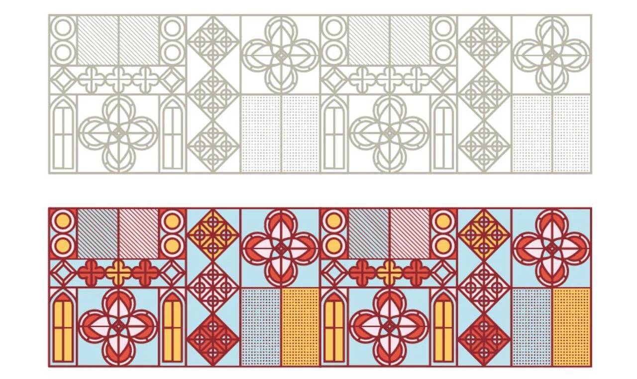
Heritage Details
These border elements, architectural details, icons, and stained glass illustrations are decorative elements used in various layouts to give a sense of formality and history to brand communications.
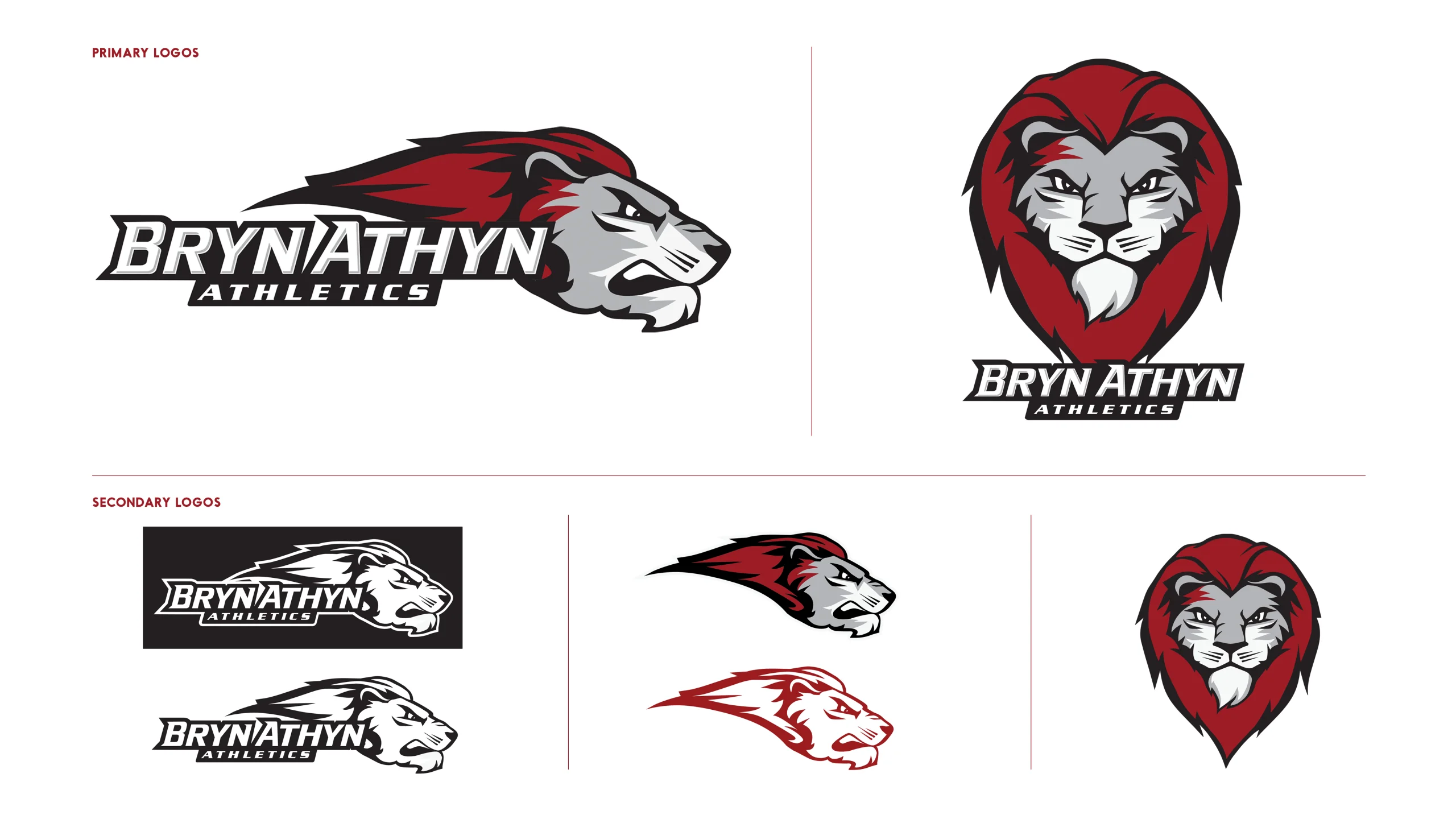
Athletics
The Bryn Athyn athletics communications use the same principles as the Bryn Athyn master brand. When designing for athletics red and white should be the prominent colors used to create a sense of team spirit. Secondary color should be used sparingly. In addition to the athletics logo, the suite of graphic spirit marks can be used to complement designs.
Athletics Logos
Athletics Stickers
Download Athletics Stickers Illustrator File
Photography
Photography is an important part of the Bryn Athyn brand toolkit. From historic architecture, to acres of natural beauty, to the day-to-day of the Bryn Athyn student, we will break down how to use these images to tell our brand story. Ideally, the majority of photos used in digital or print should be smiling and happy students, accurately representing the diversity of students found on campus (genders, races and ethnicities, athletes, abilities, majors, etc).

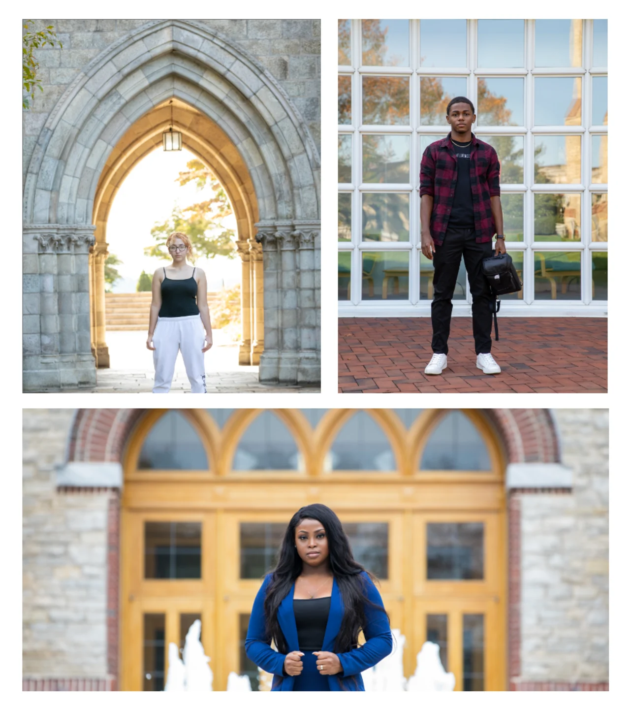
Heroic Images
Portraits should blend person and place in a considered and stylized way. We are aiming to capture the authenticity and individuality of BAC students and their surroundings. Contrary to the examples below, students should ideally be smiling.
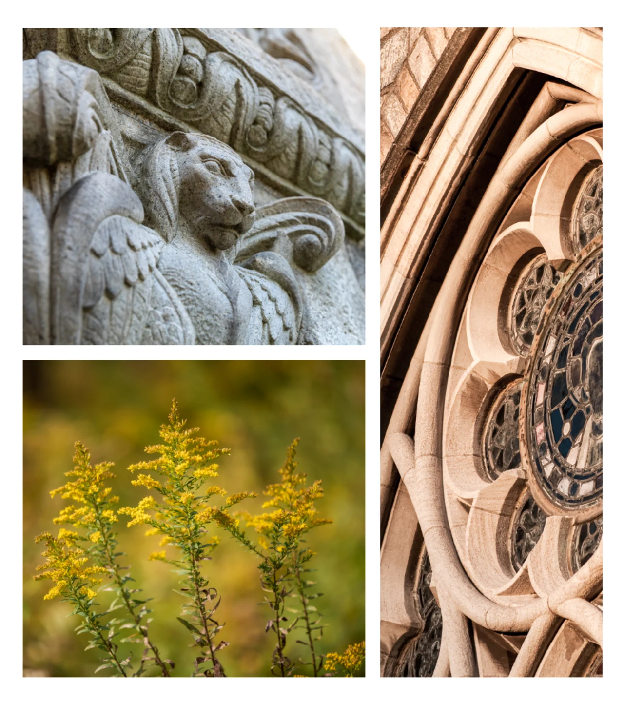
Campus Details
Architectural details are intended to portray the beauty of Bryn Athyn when you look beneath the surface. These should be decorative elements within a broader collage and not main images.
Architecture
Demonstrate the scale, stature, and beauty of Bryn Athyn’s buildings, prioritizing campus buildings rather than historic district. These, too, should be decorative elements within a broader collage and not main images.

Student Life
Student life should capture the out of the classroom Bryn Athyn experience. Shots should be candid, authentic, and fun (but not overly posed). Be sure to balance outdoor and indoor shots.

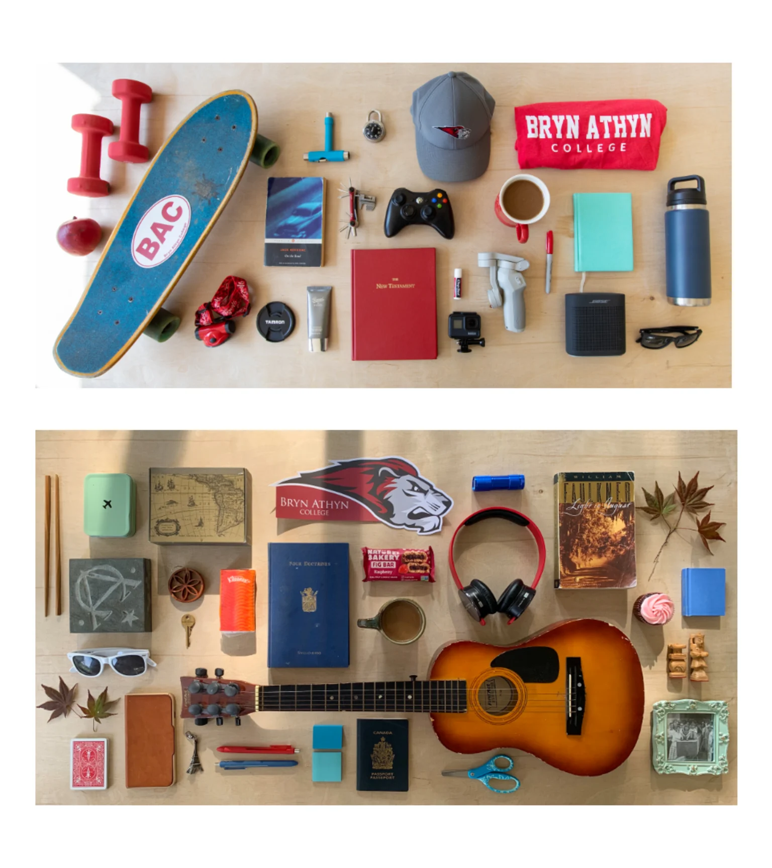
Overheads
Overhead shots are intended to offer a different perspective. We will capture the overheads of objects as well as scenes to accompany storytelling. These images are used primarily in print materials rather than digital or social media applications.
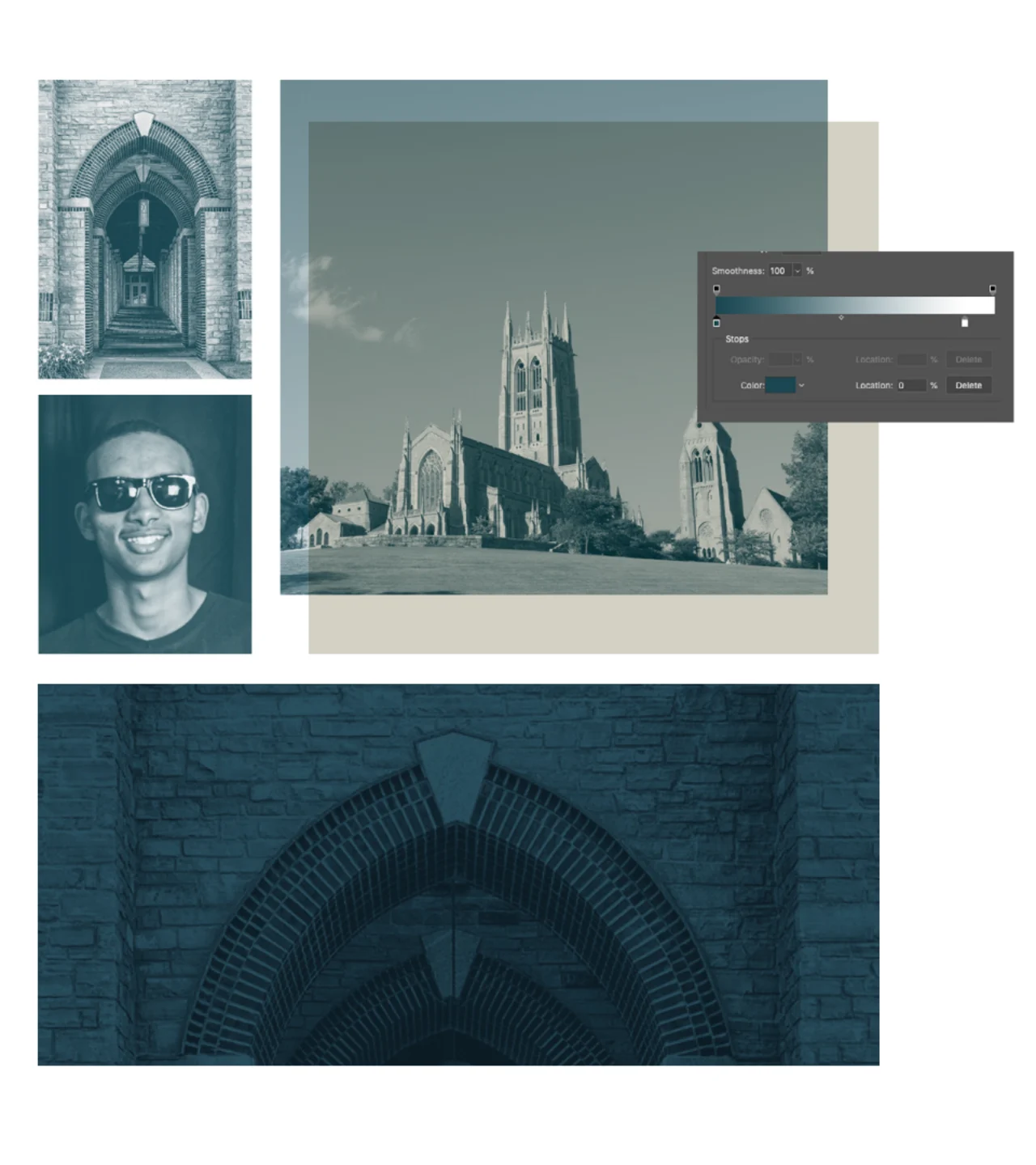
Duo-Tone
Photography doesn’t always need to be full color and at the forefront of a design. When images are used as support or background images, consider using a duo-tone style treatment. This can be applied by using a Gradient Map or Black and White layering in Photoshop and any of the BAC brand colors. You can further imply the idea of beneath the surface by overlaying these images on blocks of color.
Layout
Layout and design for the Bryn Athyn brand will shift depending on the audience, message, and medium. The following examples will provide a high-level road map for design execution.
Standard Layouts
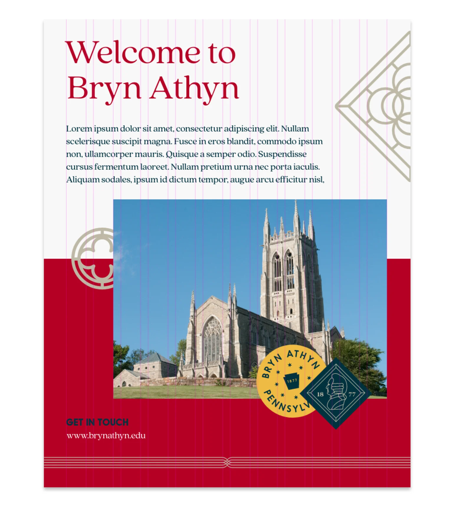
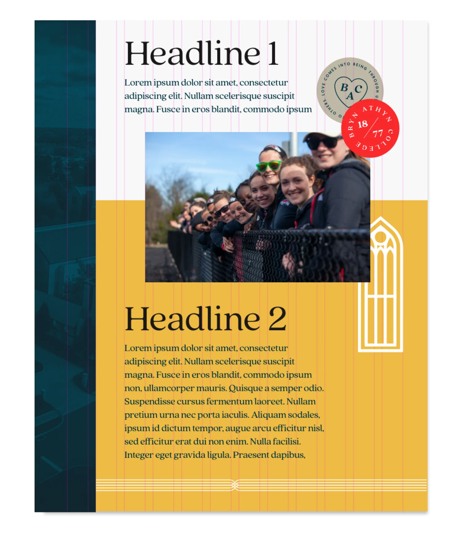
Set a grid relative to the specifications of your layout. Set type and content using the Type Hierarchy Guidelines (above). Offset images and type by aligning to a different column of your grid. This creates a dynamic layout that encourages playful discovery from the audience. An underlying sense of order is provided by aligning "floating" graphic elements to the grid.
Big Brand Moments
For big brand moments, we can lean into our bolder expressions of the Bryn Athyn brand. Bryn Athyn Red is the most prominent color used throughout. Bold type, illustration, and graphic elements should be used freely.
Digital
The same principles can be applied to all digital executions. You might encounter more restrictions depending on technical specifications. Use these examples to help dial the design up or down depending on the audience, message, and medium.
How to Create a Layout
- Step 1: Document Setup
- Before you set up your document, you must first determine the type of grid you will need to accommodate the content in your layout. The more content you have, the larger the layout grid you will likely need.
- Print: When designing for standard vertically printed collateral, use a 4 or 8-column grid. Horizontally printed collateral should be laid out using an 8 or 12-column grid.
- Digital: When designing for mobile or other vertically oriented screens (except tablets), use a 4-column grid. Designing for a tablet in its vertical orientation can be done using an 8 or 12-column grid. For horizontal tablets, desktops, or other horizontally-oriented screens, use the standard 12-column grid for the web.
- Step 2: Setting the Hierarchy of Information
- Using the type styles outlined in the above Typography section of this guide, strutcure your information in a system that uses typography – the size, font and layout of different pieces of text – to create a hierarchical division that can show users where to look for specific kinds of information.
- Align your content to the grid and include any photography or illustration that you want to be the main focus of the layout. Once you are pleased with your information system and layout, offset your image by one column. This will create a sense of energy and personality in the layout. By using the grid any offeset images will feel grounded and less like arbitrary placements.
- Step 3: Building out Your Layout
- Now that our headline has been figured out, we can move on to the rest of the composition. Build out from your headline and add the additional necessary content such as logos, patterns, photographs, body copy, and captions—aligning everything to your grid and in relation to one another. Start with larger elements like photographs and patterns. Once those have been placed, add in your secondary elements such as a campaign lockup, or photo captions.